Pugita Coffee
Visual Identity | Merchandise Design
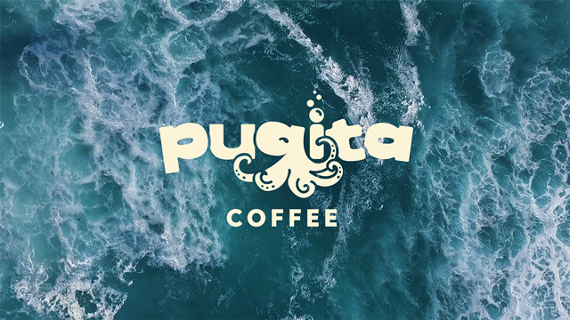
Under the C(offee)
This branding project was for an early start-up coffee shop, Pugita Coffee. Inspired by the “pugita” (Tagalog for octopus), the goal for the visual identity was to keep the nautical theme fun and playful, especially within the logotype itself. Thus, the “g” in “pugita” was the perfect shape to introduce the octopus silhouette, and mix the logomark with the logotype itself.
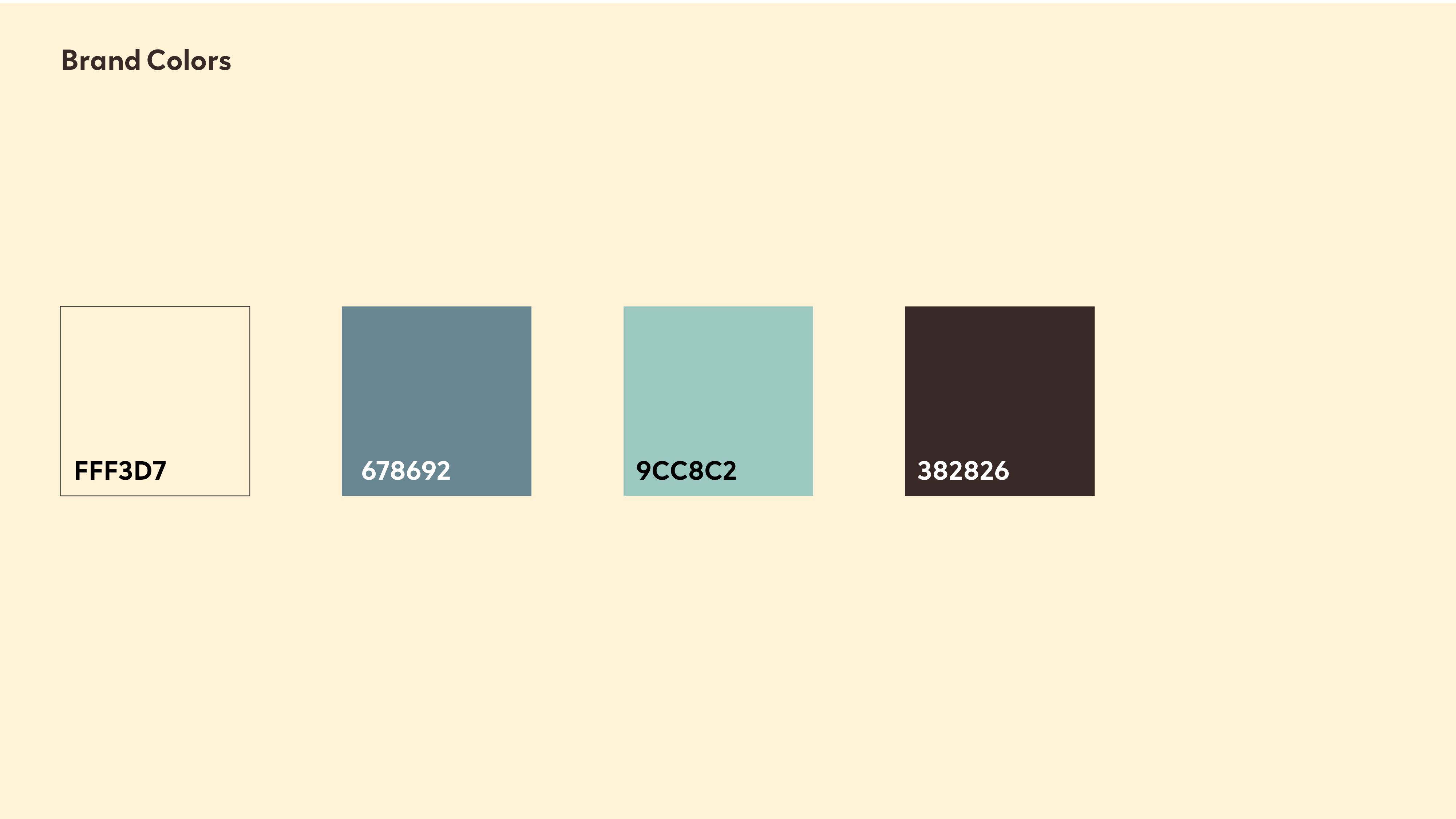
Sea Shades
Wave-inspired blues and seafoam cream was used to create a tiny but mighty set of brand colors. The dark brown was the final contrasting color, inspired by the dark rocks within the ocean. A major inspiration was Boracay in the Phillipines and its crystaline waters.
This branding project was for an early start-up coffee shop, Pugita Coffee. Inspired by the “pugita” (Tagalog for octopus), the goal for the visual identity was to keep the nautical theme fun and playful, especially within the logotype itself. Thus, the “g” in “pugita” was the perfect shape to introduce the octopus silhouette, and mix the logomark with the logotype itself.
Sea Shades
Wave-inspired blues and seafoam cream was used to create a tiny but mighty set of brand colors. The dark brown was the final contrasting color, inspired by the dark rocks within the ocean. A major inspiration was Boracay in the Phillipines and its crystaline waters.


attractivemonkey©