Copyleaks Brand Guidelines 2024 Refresh
Visual Identity | Brand GuidelinesRefreshing a Brand
When joining the team at Copyleaks, I was able to embark on the always fun yet challenging task of updating the Brand Guidelines not just to reflect the new message of the brand, but also to update and cement the new visual motifs that had become part of the core identity.
A New Leaf
As the latest addition to the design team, my core function involved re-designing the brand guidelines to reflect the new brand messaging, pillars, and full visual identity. This also included the structure and layout of the brand guidelines themselves, to show more accurate organization and differentiation in colors, gradients, and visual motifs.
Devil is in the Detail
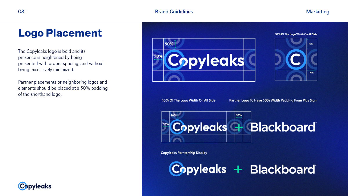
My main goal for this "refresh" of the brand guidelines was to specify and solidify visual motifs and methods of measurements that had been previously "umbrella-ed" unofficially into the brand but had not been cemented as legitimate best practices onto the guidelines. This ranged from the measurement of padding with the placement of the logo, best practices on color matching, a new color palette, and new overall visual illustration and decorative motifs that connected to the brand function. I wanted to make sure the new best practices were as specific as possible so that it would make this iteration of the brand guidelines as evergreen as could be for the future designers of Copyleaks.
Those Soulful Blues
When working on the brand guidelines refresh, there was one main rule on the table: keep the Copyleaks Blue. While the color scheme itself did not undergo an immense change, I did want to provide an extended palette that offered more color combinations and choices than the previous one. This included having specific color groups that worked in harmony with each other, as well as adhered to at least WCAG 2.0 AA Large for accessibility and legibility. This process involved the addition of two more "extended" colors (Medium Blue and Cornflour Blue) into the mix that would work with the Copyleaks blue, as well as modifying the previous Copyleaks Blue from #3f9af5 to #2b95ff for more saturation and contrast with the white text it's often paired with.
Another layer of the color choice process I wanted to bring was the extended use of gradients for backgrounds, including on the website, social media collateral, videos, emails, and one-pagers. While much of the previous collateral utilized mostly solid colors from the color palette, adding a dynamic gradient would drive home the theme of dynamism, flexibility, and movement that the brand products entail. These gradients were constructed by using the established color palette and classifying between dark, medium, and light gradients. The darker gradients were to be used universally due to their benefit of safe color contrast, while medium and light gradients are more used on social media collateral, videos, and other pieces of collateral that use bespoke compositions.
Iconic Changes
A major missing component of the visual identity was the lack of an established set of matching icons, as well as clear indications of how to use certain decorative motifs on the artboard. For the icons, built and modified a set of icons that would be sufficient for multiple uses and scenarios that the brand would require, ranging from more technical uses and specific product functions, to more "organic" and human-oriented icons for more thought-leadership collateral. Establishing this large repository was a main goal of mine so that we could keep these elements of the brand evergreen, and remove future worries of finding and modifying icons to fit niche needs.
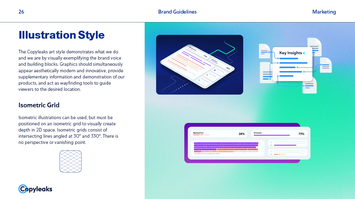
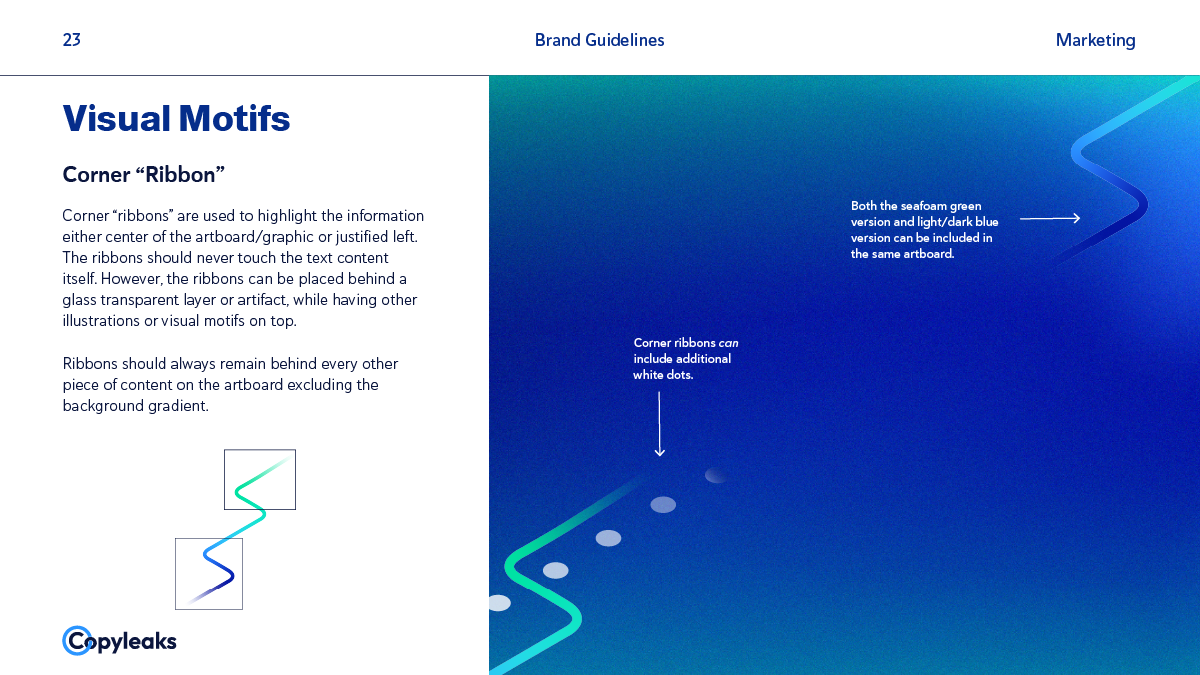
As for the illustrations and visual motifs, I wanted to cement the new specific elements that were built upon from the previous pieces, such as adding highlights to the edges of the glass morphic frames, and showing how the corner accents were cropped and modified to fit the artboard. My aim was to be as specific as possible in calling out these subtleties so that the diversion of these elements would be slim to none when being shared to and from different people within the team.
Bodies (and Headers) of Work
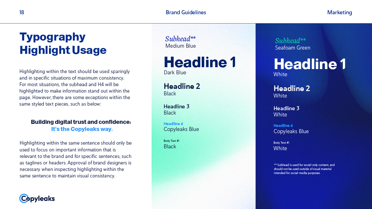
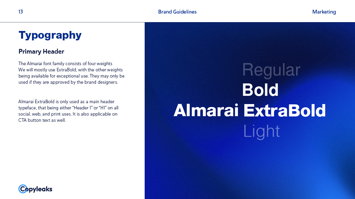
I wanted to take this opportunity of the refresh to expand the type styles of the visual identity, as this would indulge not just my request to add more experimental type lockups and stylings, but also add versatility in the collateral itself. This included expanding the different styles and iterations of Haboro Soft as headers and body copy and also introducing a new typeface (FreightTextPro) into the more bespoke and "fun" collateral, such as social media assets and videos. Adding this extra typeface would allow the more brand-driven public content to have more contrast within the typefaces when paired with Almarai or Haboro Soft due to its serif nature, and adding a more "humanistic" and elegant touch.
attractivemonkey©