PhotoShelter’s 20/21 Vision Summit
Visual Identity | Video Trailer | Campaign Design
Year
2021
Credits
Narda Avila and Todd Owyoung for creative direction and collaboration.
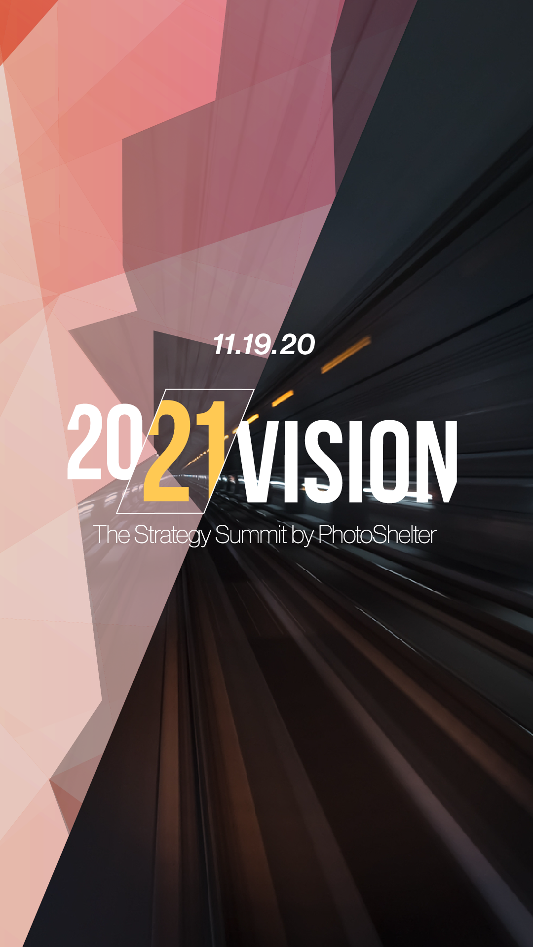
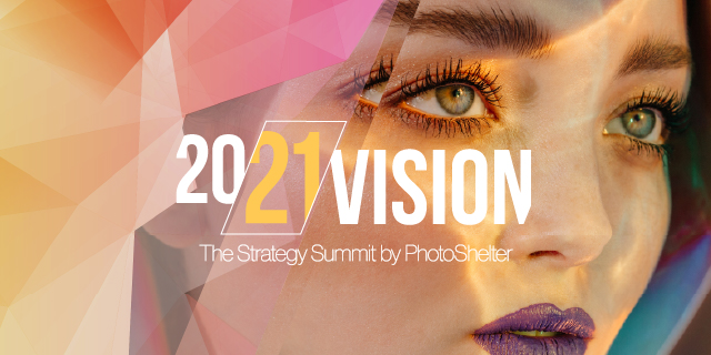
This project was determining and designing for PhotoShelter’s second virtual summit, the 20/21 Vision. The design for this summit was inspired by the first summit, the Summit For Brands. However, because the theme of this summit was looking forward to the year 2021, and the marketing opportunities that our members could take, we wanted the visual motifs to include light, vision, reflections, overlaps, and the idea of transitions where one element ends and the other ones begins.
Again as a collaborative work within the PhotoShelter design team, we felt that we wanted the event ID to show the transition between 20 to 21, not just as a visual pun but also to show the optimism of the new year. The idea of the crystal background/glass was also inspired by the gradient from the last summit, but with the idea of blending it onto the photography and the crystaline pattern it takes when enveloping it. This idea of “glass” and reflections also is “reflected” in the slice between the 20/21, as if the 21 is either slicing through, or being overlapped in front.
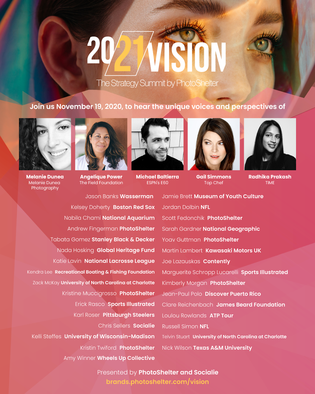
Like the previous summit, a concert poster was also included to include the roster, as well as a designed landing page for the event.


attractivemonkey©
