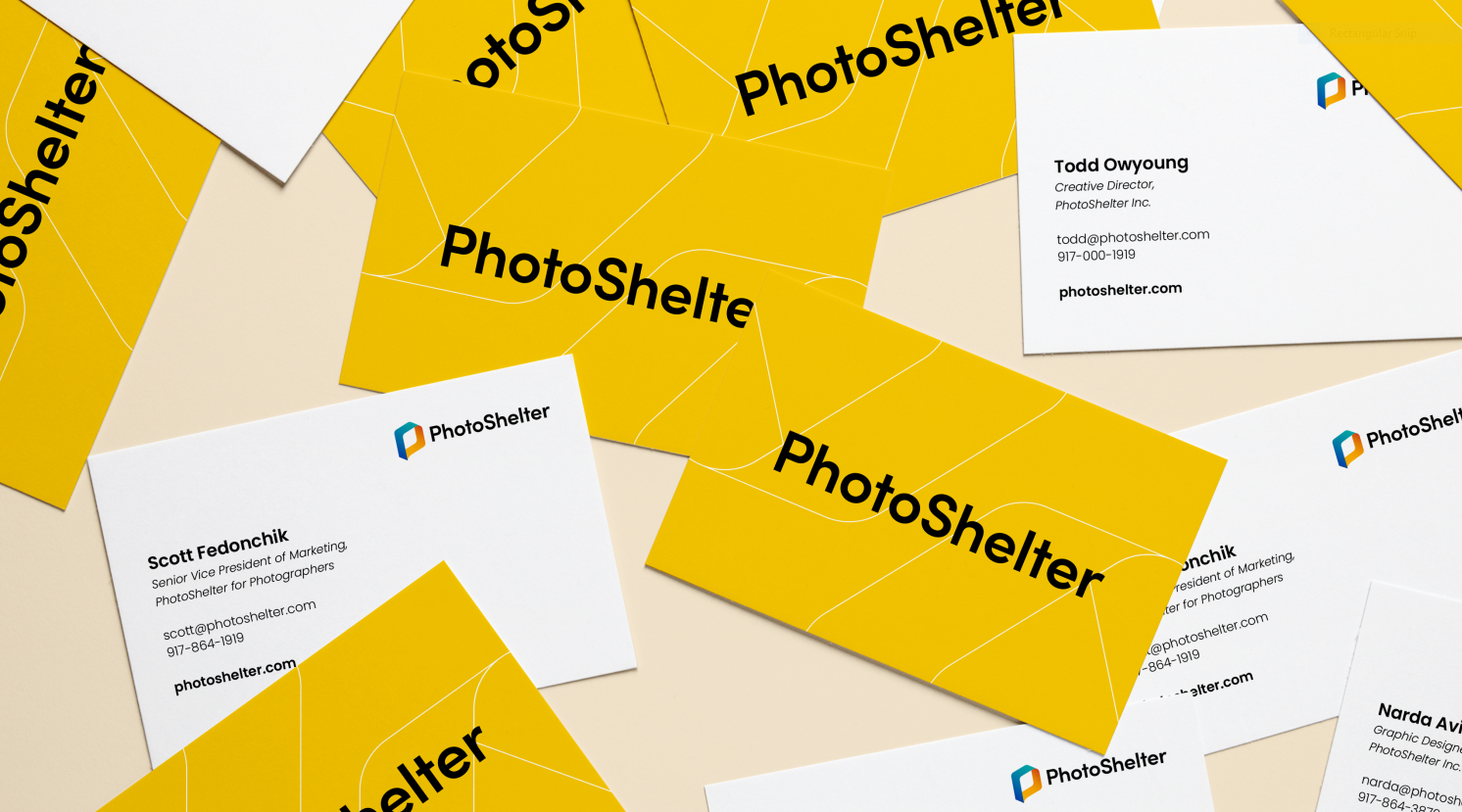
PhotoShelter’s Visual Identity Rebrand
Visual Identity | UI Design | Video Trailer | Brand Guidelines
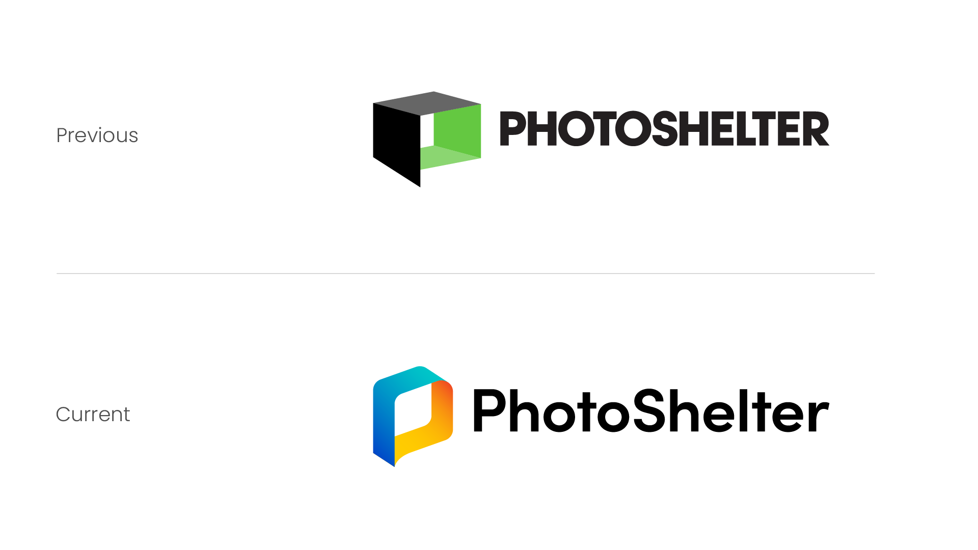
Evolving A Brand
As PhotoShelter’s products evolve, we wanted to represent this in the visual identity as well. This was a collaborative effort amongst the PhotoShelter design team. As a team, we really wanted to show the dynamism, boldness, and heartfelt spirit that PhotoShelter embodied and delivered to their members everyday. While we felt the old visual identity was very loud and eye-catching, it felt that it was a bit too large and rigid, and was in need of a more sleek and modern look.


Designing For Two
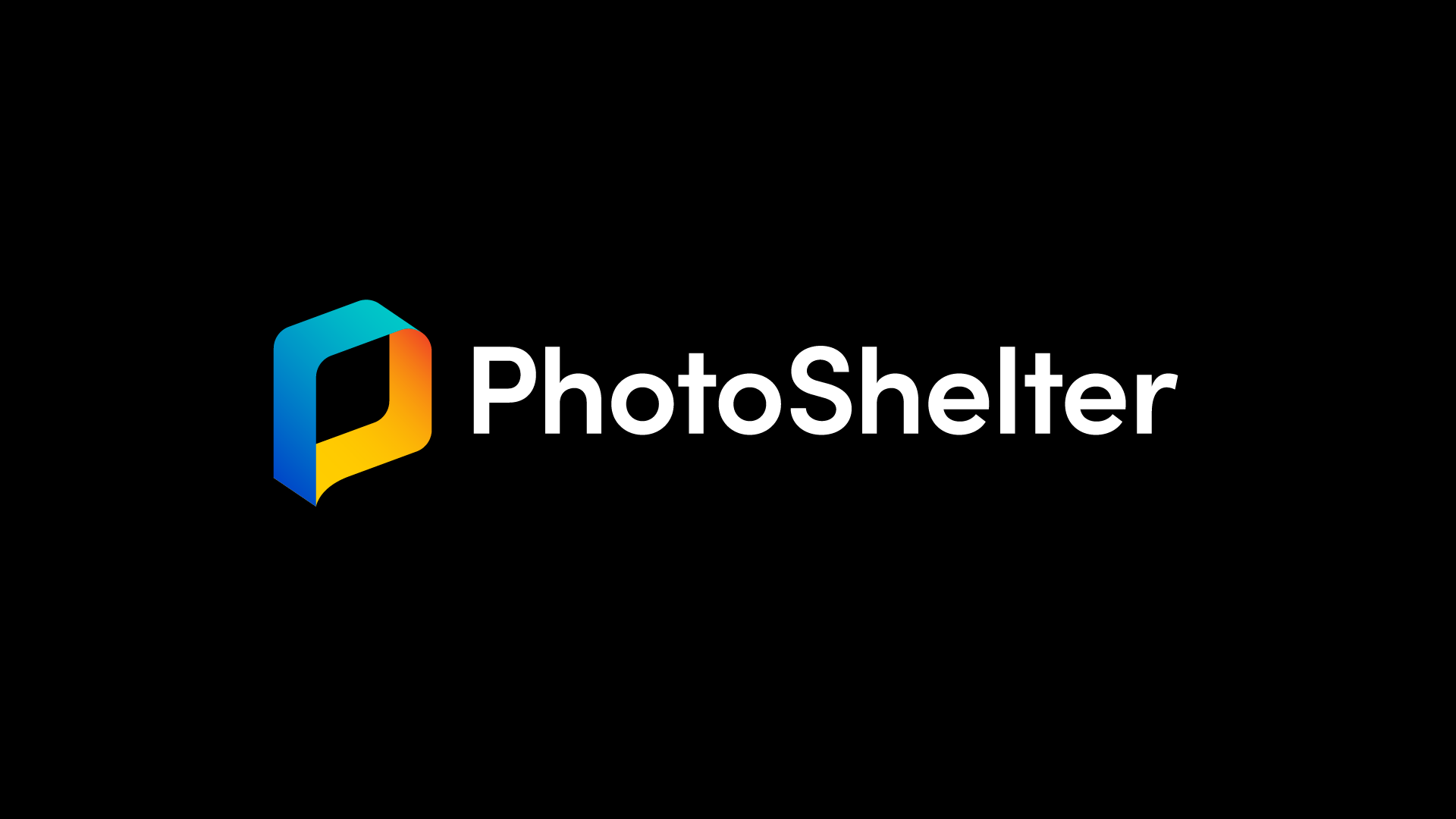
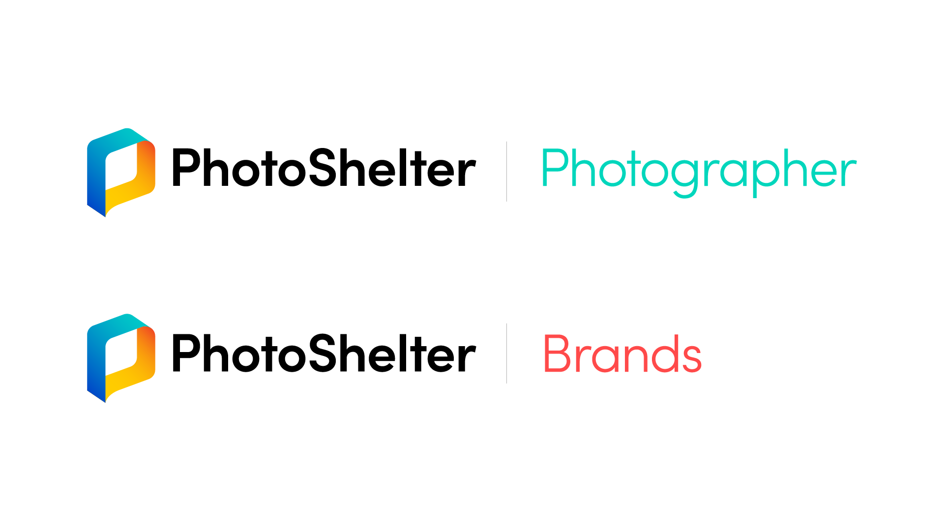
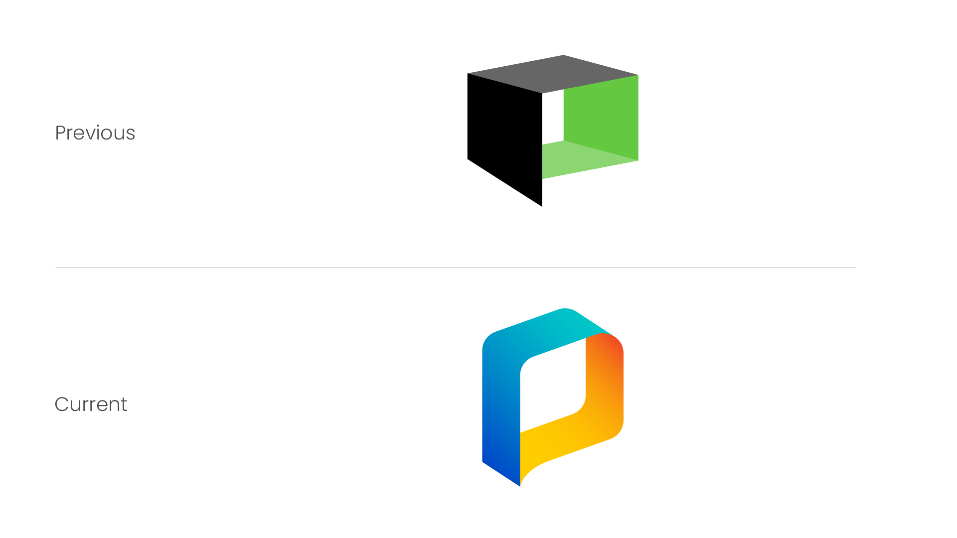
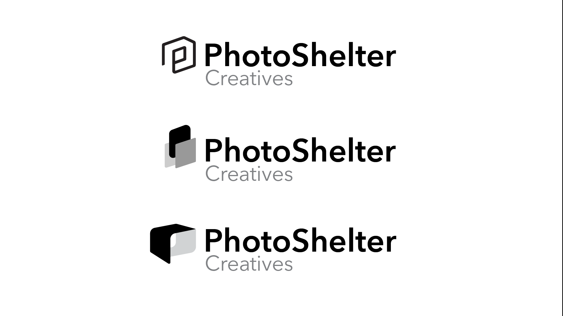
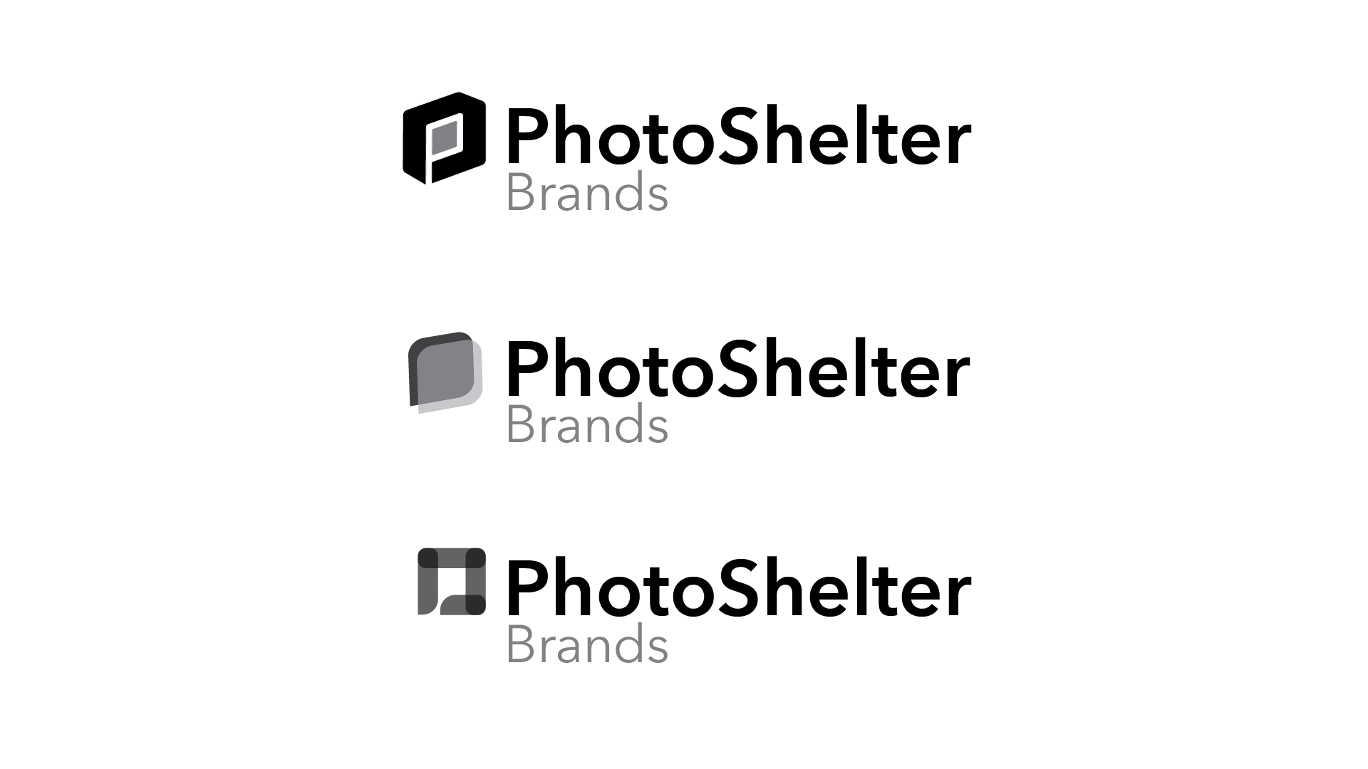
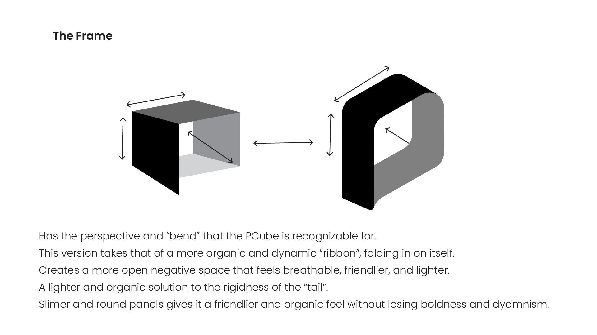
For this, we kept the overall structure of the formerly known “P-Cube” logomark, and transformed it into something friendlier and sleeker, which we now refer to as the “P-loop”. The P-loop’s ribbon structure was meant to emphasize the feeling of speed, movement, and fluid direction, and alluding to the light-speed in which the PhotoShelter product would work in. This was emphasized more so by the new color-way of the P-loop, with the two contrasting gradients representing the two products PhotoShelter presents for its two different member base: Brands and Photographers. This direction of duality is a motif that was carefully considered amongst the other factors of the rebrand, such as color palettes and iconography, as to show how two products live under the umbrellla of a unified brand. This was also due to migrating the formerly known “Libris by PhotoShelter” sub-brand and product (a product targeted at enterprises, brands, and organizations) into the overall PhotoShelter visual umbrella.
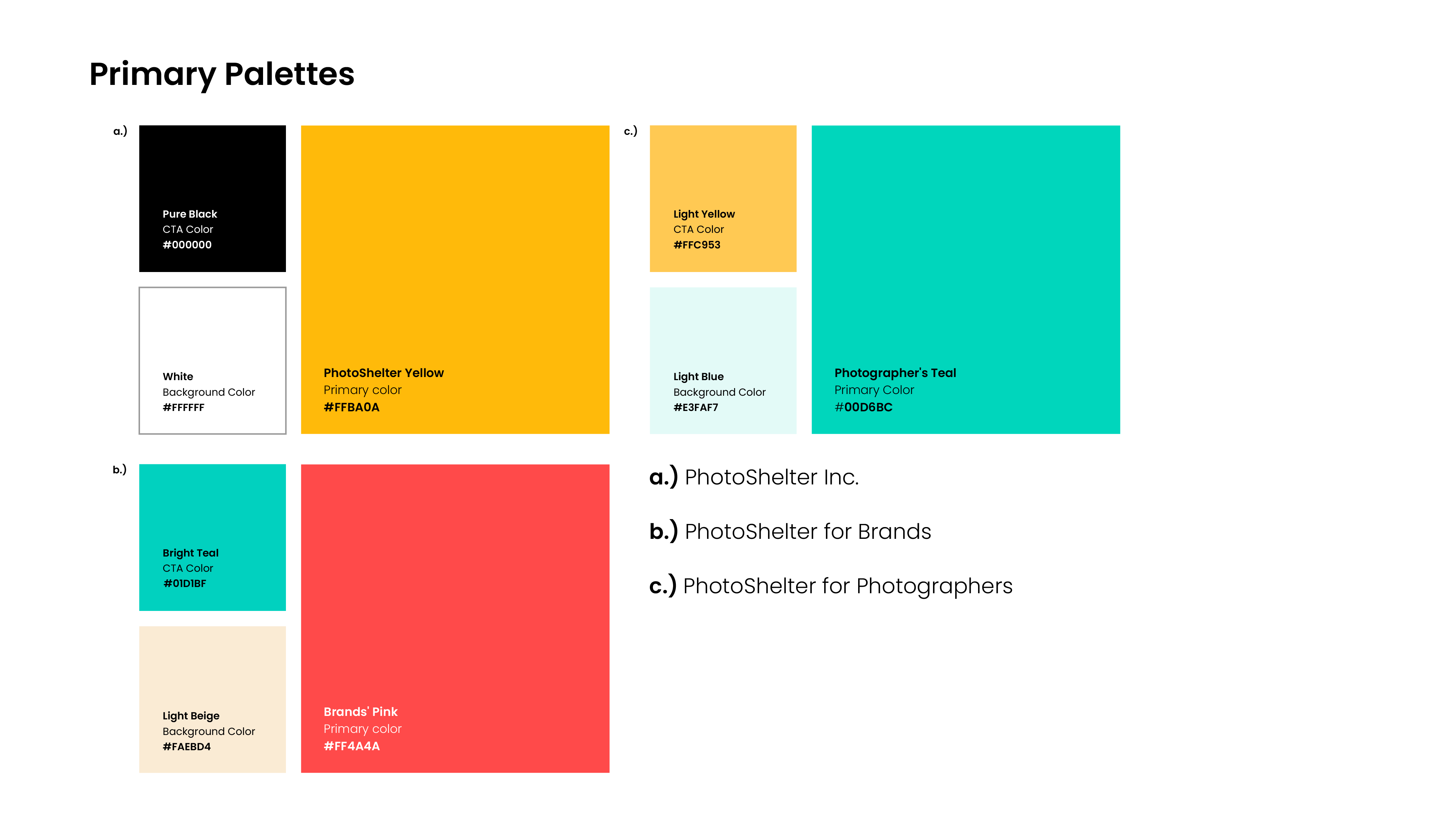
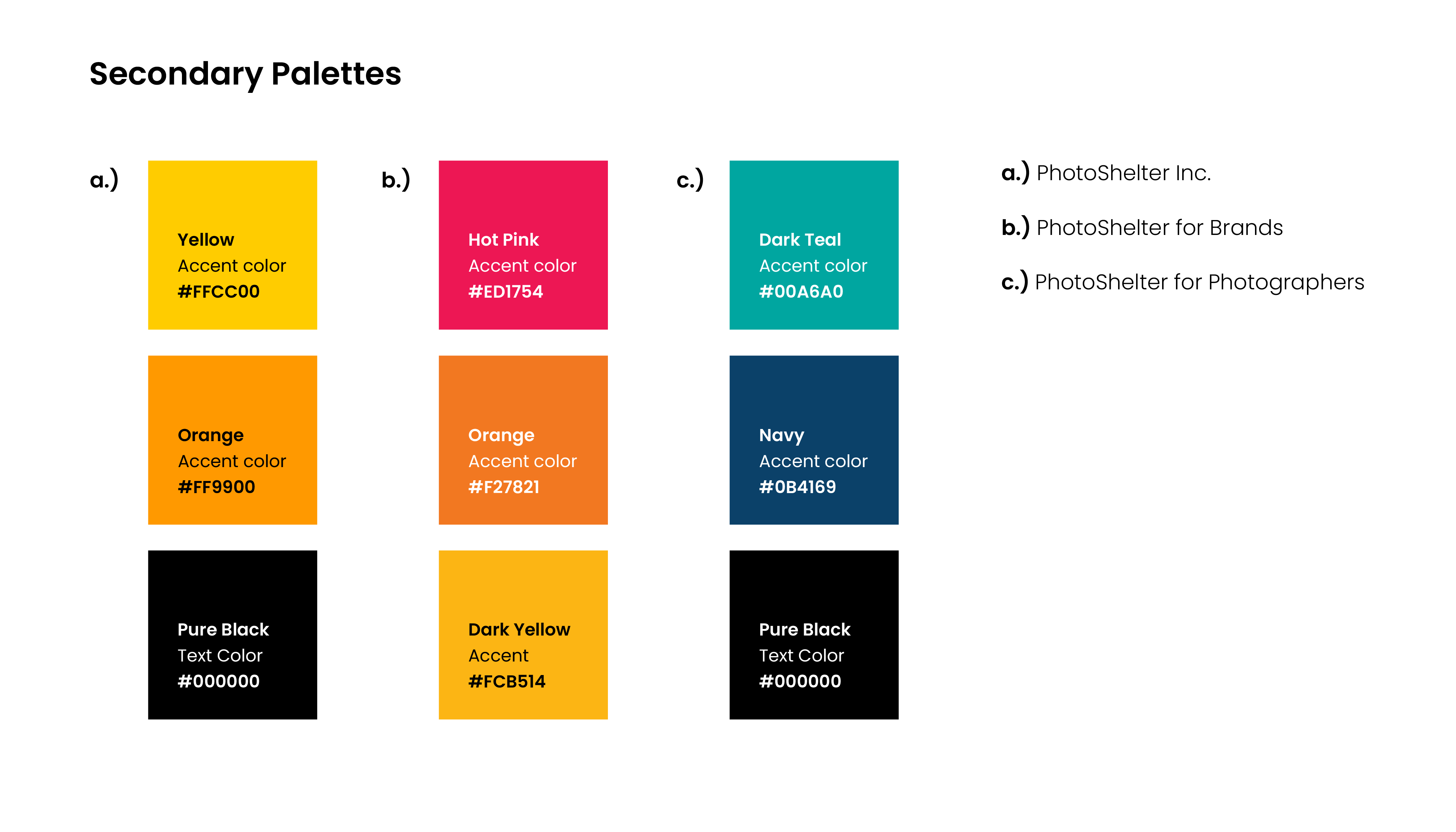
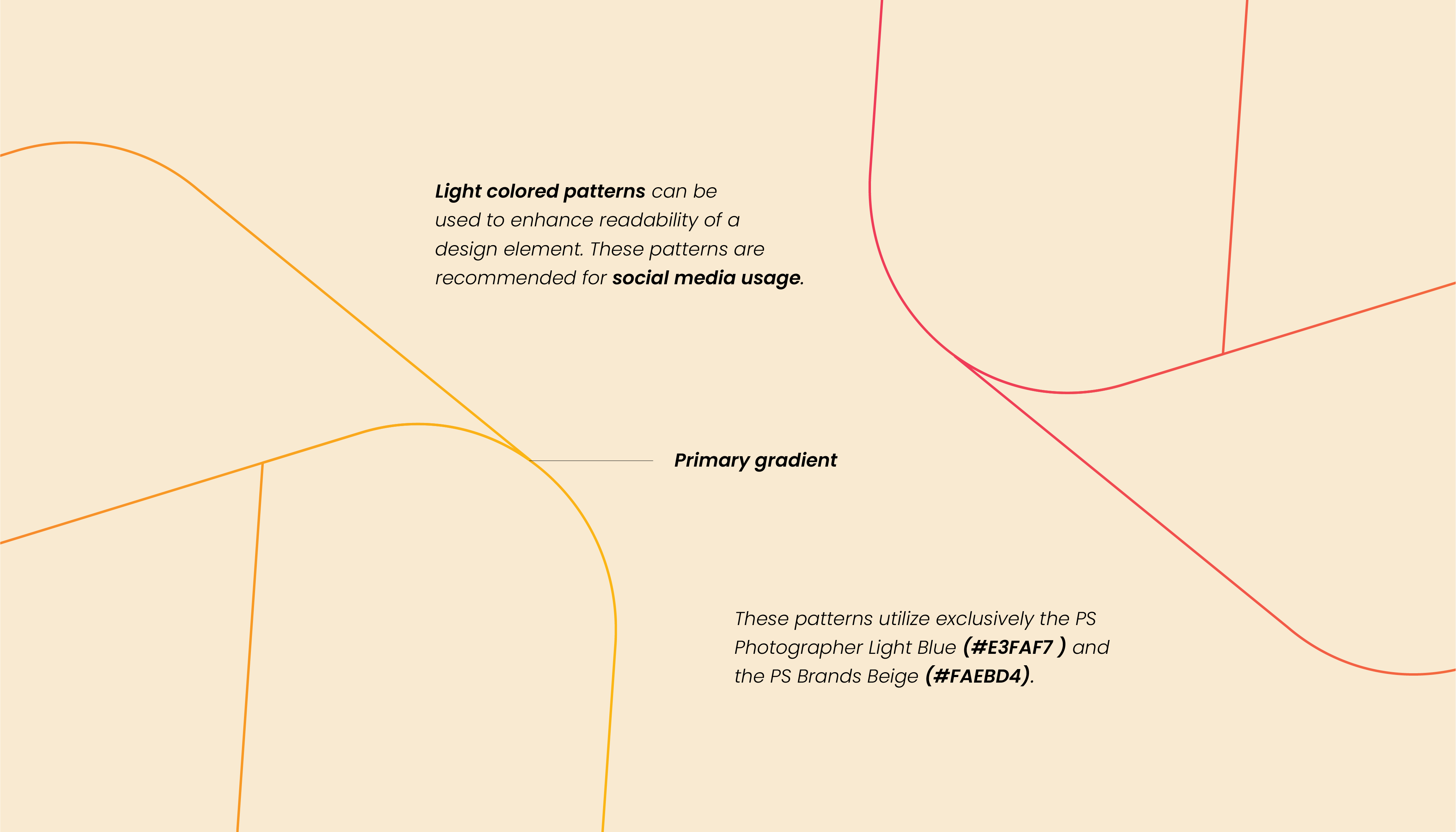
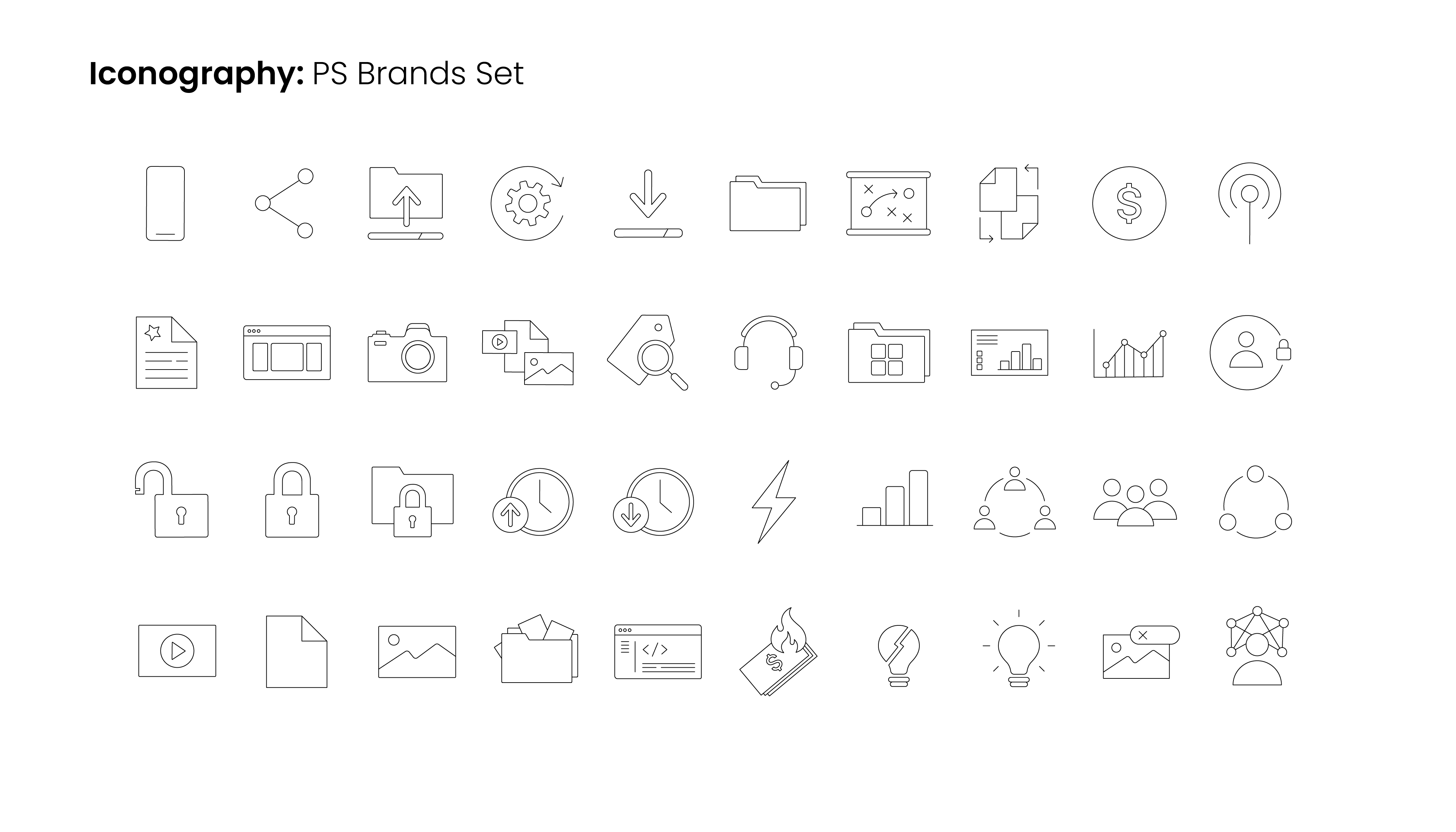
To fully flesh out the visual identity, factors like illustrations, icons, embellishments, and gradients were also considered.


The Journey To Success
Many iterations were considered in adapting the P-cube to a modern version. We deconstructed the P-cube into many frameworks, while trying to keep the general structure intact; this is due to us wanting to keep the feeling of the “magic in the middle”, or the optical illusion of the gap in the middle. This gap was important to keep intact, as we also felt it gave the feeling of “capturing the moment” within the structure.
In Motion
To debut the new rebrand, we thought it would be fitting to bid adiue to the P-cube, and bring in the P-loop in a fun and vibrant way that not only showcases the new look, but also brings in the new essence and energy that came with the rebrand.
A New Web Experience
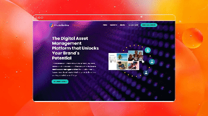
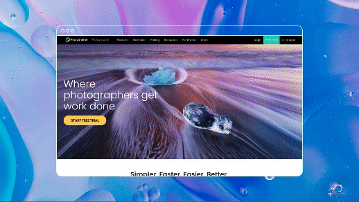
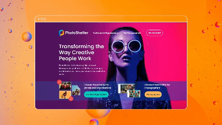
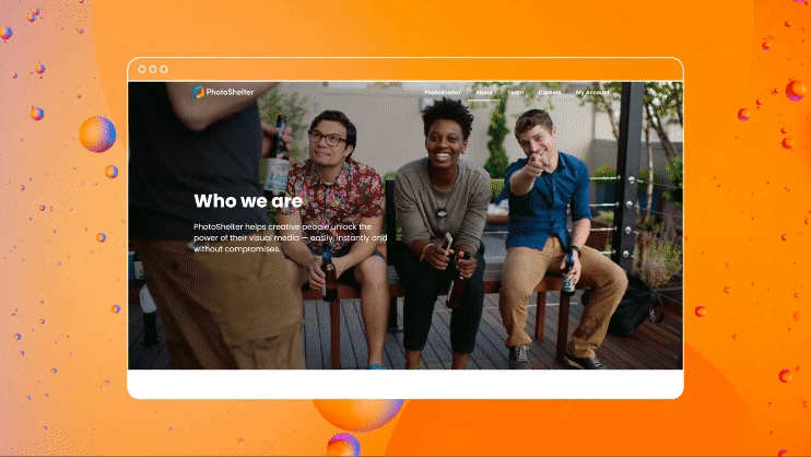
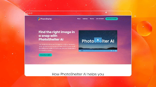
As part of the new debut, the PhotoShelter Brands page was also renovated to match its new visual identity, and to be easier and more pleasing to the user to navigate through the page. You can find the live site here.

attractivemonkey©